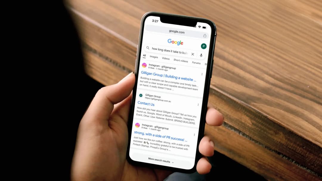
Why does your website need to be mobile responsive?
There are a few reasons why you should ensure your website or future website is mobile-responsive.
First, navigating on desktops is becoming a thing of the past, with mobile devices rapidly emerging as the most preferred method of accessing the web. As of late 2023, mobile devices were responsible for a greater share of the world’s internet traffic than ever before – a whopping 58%. So if your site doesn’t display well on a phone, you’re missing out on more than half of your prospective audience.
Second, leading search engines such as Google are now using 100% mobile-first indexing. Mobile responsiveness has begun to take precedence as one of the biggest ranking factors.
How does Google determine mobile responsiveness of your site?
To determine mobile responsiveness, Google looks at a group of elements dubbed the Core Web Vitals, which measure user experience.
At present, the three Core Web Vital components are Largest Contentful Paint (LCP), Cumulative Layout Shift (CLS) and First Input Delay (FID), which evaluate loading performance, visual stability and interactivity respectively.
Common elements that are detrimental to your Core Web Vitals include images without specified dimensions, slow hosting, and sub-standard caching solutions. Poorly configured advertisements and other embedded elements (including clunky iframes) are also frequently identified as culprits.
Not sure if your website is mobile friendly? Test it for yourself!
If you’ve noticed that your site has been ranking low on search engines, our digital strategist advises conducting a self-audit to evaluate its effectiveness on mobile browsers. Open your site on your smartphone run through the checklist:
- Did it load in under 3 seconds?
- Can you read all text?
- Can you easily click buttons and links?
- Is there any content displaying outside the screen borders?
- Do you have a hamburger menu (one that expands from basic categories to offer more specific links) designed for mobile use?
- Is your site’s meta data optimised for mobile? To ensure your site’s key information shows up easily in SERPS (search engine results pages), be as concise as possible – without sacrificing the quality of the information – when creating titles, URLs, and meta descriptions.
- Are you optimized for local search?
- Have you implemented structured data?
If you’re noticing problems with any of these aspects, you can be sure your customers will too.
As search technology evolves and customers continue striving for greater convenience and efficiency, it is more important than ever that your business works to offer the latest in website best practice.
Need some help bringing your site up to 2024 standards? Contact Gilligan Group’s digital team to learn more about our SEO and UX website development services.


